
Two analysts can load the same data into Power BI and produce wildly different results. One builds reports that load instantly, calculate correctly, and remain easy to extend as requirements grow. The other fights slow refreshes, wrong totals, and DAX measures that refuse to behave and eventually rebuilds the whole thing from scratch. The difference between them is rarely the data or the visuals. It is the data model underneath.
Power BI data modeling is the discipline of structuring your tables and defining the relationships between them so that the entire report behaves predictably, performs quickly, and calculates accurately. It sits directly between the data you cleaned in Power Query and the measures you write in DAX, and it is the single most under-appreciated skill in Power BI. Most beginners skip past it entirely, dragging raw tables into visuals and wondering why nothing works as expected.
This guide explains data modeling from first principles. You will learn what fact and dimension tables are, how star and snowflake schemas differ, how relationships and filter directions work, and how to build a model that scales. It includes a complete hospital medical equipment data model that shows these principles applied to a genuinely complex operational scenario.
This article is part of the Zytriona Power BI learning series. It builds directly on Power Query in Power BI Explained (data preparation) and Beginner’s Guide to DAX in Power BI (calculations). If you are new to the platform, start with What Is Power BI? before continuing.
What Is Data Modeling in Power BI?
Data modeling in Power BI is the process of organizing your tables, defining relationships between them, and structuring the data so that it can be analyzed accurately and efficiently. A data model is the collection of tables, the relationships that connect them, and the calculations built on top of them.
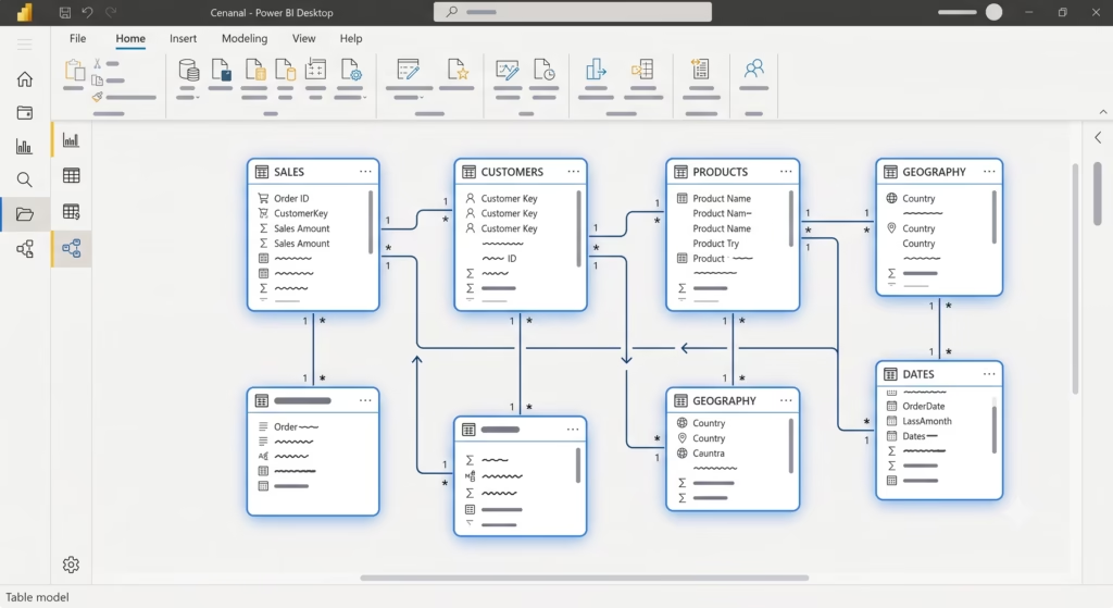
Think of the data model as the engine room of a Power BI report. The visuals on the canvas are what people see, but the model is what makes those visuals possible. When you place a “Total Sales by Region” chart on a page, Power BI relies on the relationships in your data model to know how the Sales table connects to the Region table. Without a correct model, that connection either does not exist or produces wrong results.
Power BI uses a technology called the VertiPaq engine, an in-memory columnar database, to store and query the data model. According to Microsoft’s official data modeling documentation, the way you structure relationships directly determines how filters flow through the model and how calculations are evaluated. This is why modeling is not a cosmetic step. It is the foundation that every measure and every visual depends on.
You work on your data model primarily in the Model View of Power BI Desktop, the third icon on the left sidebar, below Report View and Table View. Model View displays your tables as boxes and the relationships between them as connecting lines, giving you a visual map of the entire model’s structure.
Why Data Modeling Is Important
A well-built data model delivers three things that a poorly built one cannot: accuracy, performance, and maintainability.
Accuracy. Relationships determine how data in one table filters data in another. When the model is structured correctly, a filter on the Date table automatically and correctly filters the Sales table. When it is structured incorrectly, totals double-count, categories fail to filter, and numbers that look plausible are quietly wrong — the most dangerous kind of error in business reporting.
Performance. The structure of a data model has a direct and often dramatic effect on report speed. A properly structured model with a clean star schema can be many times faster than a flat, single-table model containing the same data. Slow reports are frequently blamed on data volume when the real cause is a poor model structure.
Maintainability. Business requirements change. New metrics are requested, new data sources are added, and new dimensions become relevant. A clean data model absorbs these changes easily. A tangled model where everything connects to everything and no clear structure exists becomes progressively harder to extend until it has to be rebuilt.
The most common reason beginners struggle with DAX is not the DAX language itself it is that they write DAX against a broken data model. As Microsoft’s DAX guidance and the widely respected data modeling reference at SQLBI both emphasize, correct modeling makes DAX dramatically simpler. Many measures that are difficult or impossible against a bad model become trivial against a good one.
Understanding Fact and Dimension Tables
The foundation of good data modeling is understanding the two fundamental table types: fact tables and dimension tables. Nearly every well-built Power BI model organizes its tables into these two categories.

What Is a Fact Table?
A fact table stores the measurable, quantitative events of a business the things you count, sum, and average. Each row in a fact table represents a single event or transaction, and the table typically contains numeric values (measures) alongside keys that link to dimension tables.
Examples of fact tables include a Sales table (one row per sale, with quantity and amount), a Maintenance Log (one row per maintenance event, with duration and cost), or a Website Sessions table (one row per visit). Fact tables are usually the largest tables in a model; they grow continuously as the business generates new transactions.
What Is a Dimension Table?
A dimension table stores the descriptive context the “who, what, where, and when” that gives meaning to the facts. Each row represents a unique entity, and dimension tables are typically much smaller than fact tables and grow slowly.
Examples of dimension tables include a Product table (one row per product, with name, category, and price), a Customer table (one row per customer, with name and region), a Date table (one row per calendar date), and an Employee table (one row per staff member).
How They Work Together
The relationship between fact and dimension tables is the core of the model. The fact table sits at the center, holding the events. The dimension tables surround it, holding the descriptive attributes. A single Sales fact row references a product (via the Product dimension), a customer (via the Customer dimension), and a date (via the Date dimension).
This separation is powerful because it eliminates repetition. Instead of storing the full product name, category, and supplier on every one of a million sales rows, you store a short product key on the fact table and keep the descriptive detail once in the Product dimension. This is both more efficient and easier to maintain.
Star Schema Explained
A star schema is a data modeling structure where a single central fact table connects directly to multiple surrounding dimension tables, forming a shape that resembles a star. It is the recommended structure for the vast majority of Power BI models.
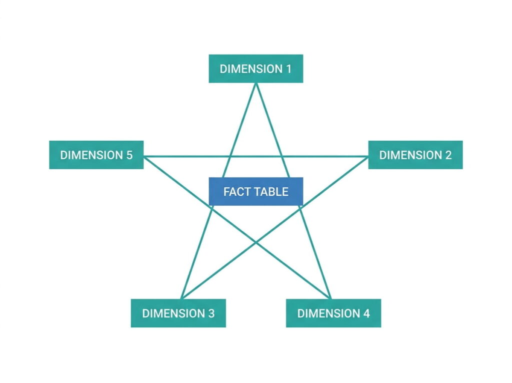
In a star schema, every dimension table connects directly to the fact table with a single relationship. The Date dimension connects to the fact table. The Product dimension connects to the fact table. The Customer dimension connects to the fact table. None of the dimensions connect; they all radiate out from the central fact table like points of a star.
Microsoft explicitly recommends the star schema as the optimal design approach for Power BI. The reasons are concrete. Star schemas produce simpler relationships, which means filters flow predictably. They keep DAX measures straightforward, because the path from any dimension to the facts is always a single step. And they perform well, because the VertiPaq engine is optimized for exactly this structure.
For a beginner, the practical takeaway is simple: aim to organize every model as a star schema. One central fact table, dimension tables around it, each connecting directly to the fact table. When you find yourself deviating from this shape, there should be a specific, deliberate reason.
Snowflake Schema Explained
A snowflake schema is a variation of the star schema where dimension tables are broken into further related tables, creating additional layers that branch out from the dimensions. The shape resembles a snowflake rather than a simple star.
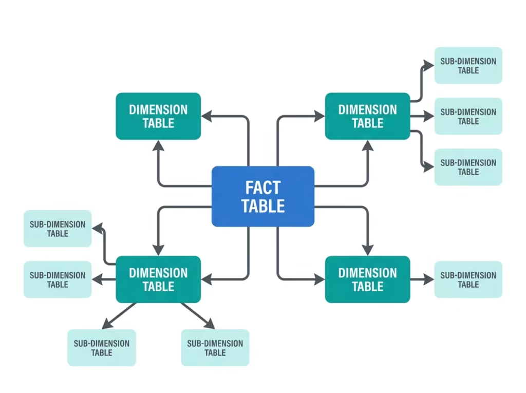
In a snowflake schema, a dimension table connects to another dimension table before reaching the fact table. For example, instead of a single Product dimension containing product, category, and department, a snowflake model might have a Product table that links to a separate Category table, which links to a separate Department table. The descriptive hierarchy is normalized across multiple tables rather than flattened into one.
Snowflake schemas reduce data redundancy because shared attributes are stored once in their own table. This is standard practice in traditional relational database design. However, in Power BI specifically, the additional relationships add complexity, can slow query performance, and make DAX measures more involved because filters must travel through more relationship hops to reach the fact table.
Star Schema vs Snowflake Schema
| Feature | Star Schema | Snowflake Schema |
|---|---|---|
| Performance | Faster | Slightly slower |
| Simplicity | Easy to understand and build | More complex |
| Storage | More redundant (attributes repeated) | Less redundant (attributes normalized) |
| Relationship hops | Single hop to fact table | Multiple hops to fact table |
| DAX complexity | Simpler measures | More involved measures |
| Beginner friendly | Yes | No |
| Recommended for Power BI | Yes | Sometimes |
The practical guidance for Power BI is clear: prefer the star schema. Snowflake structures have legitimate uses for very large dimension tables with genuinely repeating sub-groups, or scenarios where a shared dimension must be maintained centrally, but for most business reporting, flattening dimensions into a star schema produces a faster, simpler, more maintainable model. When in doubt, denormalize into a star.
Relationship Types in Power BI
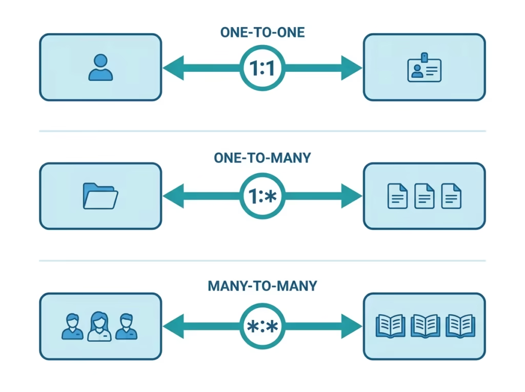
Relationships are the connections that allow tables to filter one another. Power BI supports three relationship cardinalities, and understanding each is essential to building a correct model.
One-to-Many Relationships
A one-to-many relationship is the standard, most common relationship in Power BI, connecting a single row in a dimension table to many rows in a fact table. One product appears in many sales. One date appears in many transactions. One customer places many orders.
In a star schema, virtually every relationship is one-to-many, running from the “one” side (the dimension table) to the “many” side (the fact table). This is the relationship type you will use most often, and it is the one Power BI’s VertiPaq engine is most optimized to handle.
One-to-One Relationships
A one-to-one relationship connects a single row in one table to a single row in another table. Each value in the key column is unique on both sides.
One-to-one relationships are relatively rare and often signal that the two tables should simply be combined into a single table. A legitimate use is separating sensitive or infrequently used columns into their own table for security or performance reasons, but for most beginners, encountering a one-to-one relationship is a prompt to reconsider whether the tables should be merged.
Many-to-Many Relationships
A many-to-many relationship connects multiple rows on one side to multiple rows on the other, where the key column contains duplicate values on both sides. For example, a student can enroll in many courses, and each course contains many students.
Power BI does support many-to-many relationships directly, but they require careful handling. They can produce ambiguous filter paths and unexpected results if not designed deliberately. Microsoft’s guidance on many-to-many relationships recommends resolving them where possible using a bridge table, an intermediate dimension table that sits between the two many-sided tables and converts the single many-to-many relationship into two clean one-to-many relationships. For beginners, the bridge table approach is almost always the safer, clearer solution.
Understanding Filter Direction
Filter direction determines how a filter applied to one table flows to the tables related to it. This concept trips up many beginners, and understanding it resolves a large share of “why is my measure wrong?” problems.
Single-direction filtering is the default and the recommended setting for star schemas. In single-direction filtering, the filter flows from the “one” side to the “many” side, from the dimension table to the fact table. When you filter the Product dimension to a single category, that filter flows down to the Sales fact table, and your measures calculate only for that category. The filter does not flow back up from the fact table to the dimension.
Bidirectional filtering allows the filter to flow in both directions across a relationship. While occasionally necessary, particularly for certain many-to-many scenarios or specific slicer behaviors, bidirectional filtering should be used sparingly. It can create ambiguous filter paths, slow performance, and produce results that are difficult to predict. As a general rule, keep relationships single-direction unless there is a specific, well-understood reason to enable bidirectional filtering.
The practical principle: a clean star schema with single-direction relationships from dimensions to facts is predictable, fast, and correct for the overwhelming majority of reporting needs.
Active vs Inactive Relationships
Power BI allows only one active relationship between any two tables at a time, but you can create additional inactive relationships to be used selectively in specific calculations.
Consider a Sales fact table with two date columns: Order Date and Ship Date. Both should relate to the Date dimension, but Power BI permits only one active relationship. You would set the Order Date relationship as active (shown as a solid line in Model View) and the Ship Date relationship as inactive (shown as a dashed line).
The active relationship is used by default in all calculations. The inactive relationship sits dormant until you deliberately invoke it in a specific measure using the DAX function USERELATIONSHIP. For example:
Sales by Ship Date =
CALCULATE(
    [Total Sales],
    USERELATIONSHIP(Sales[ShipDate], 'Date'[Date])
)
This measure temporarily activates the Ship Date relationship for its calculation, allowing you to analyze sales by ship date while all your other measures continue to use order date. This technique, covered further in our Beginner’s Guide to DAX in Power BI, is how a single fact table supports multiple date-based perspectives without duplicating data.
The Importance of a Date Table
A dedicated Date table is one of the most important components of a well-built Power BI model, and it is required for time intelligence calculations to work correctly. Nearly every business model needs one.
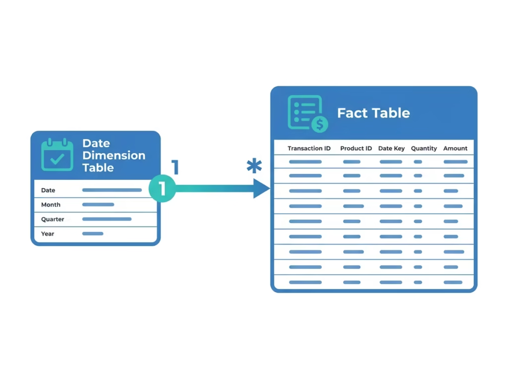
A proper Date table contains one row for every calendar date across the full range of your data, with no gaps. It includes columns for year, quarter, month, month name, day of week, and any other date attributes your reports need — fiscal periods, holiday flags, week numbers. This table connects to the date column in your fact table through a one-to-many relationship.
The reason a dedicated Date table matters is that DAX time intelligence functions
( TOTALYTD, SAMEPERIODLASTYEAR, DATEADD ) and others require a continuous, marked Date table to function reliably. Relying on Power BI’s automatic date hierarchy or the raw date column in the fact table produces incorrect or unpredictable results for anything beyond the simplest time analysis.
Once your Date table is built and connected, mark it as a date table in Power BI (right-click the table → Mark as Date Table) so the engine recognizes it correctly. The mechanics of building one are covered in [Beginner’s Guide to DAX in Power BI], and Microsoft’s documentation on creating date tables provides the full technical detail. The core message for modeling: no serious Power BI model is complete without a dedicated, properly marked Date table.
Understanding Keys: Surrogate and Composite
Keys are the columns that relationships are built on. Understanding two key concepts helps you build cleaner, more reliable models.
A surrogate key is a simple, system-generated identifier, usually a sequential integer, used to uniquely identify each row in a dimension table, in place of a “natural” key that carries business meaning. For example, instead of relating tables on a product name (a natural key that might change or contain duplicates), you relate them on a ProductKey integer. Surrogate keys are compact, stable, and efficient. The VertiPaq engine handles integer relationships far more efficiently than long text relationships, so surrogate keys improve both performance and reliability.
A composite key is a key made up of two or more columns combined, used when no single column uniquely identifies a row. For example, a sales table might need both StoreID and Date together to uniquely identify a daily store total. Power BI relationships can only be built on a single column, so when a composite key is required, the standard practice is to combine the relevant columns into a single new key column in Power Query before loading, as covered in Power Query in Power BI Explained, and then build the relationship on that combined column.
For beginners, the practical takeaway is: relate tables on clean integer keys wherever possible, and when a relationship logically requires multiple columns, create a single combined key column in Power Query rather than attempting to relate on multiple columns directly.
Building Your First Data Model
The following sequence takes a set of loaded tables and turns them into a clean, functional star schema.
Step 1: Identify your fact table. Determine which table holds the measurable events the transactions you will count and sum. This is your central fact table. In a sales model, this is the Sales table.
Step 2: Identify your dimension tables. Determine which tables hold descriptive context: products, customers, dates, regions, employees. These become the points of your star.
Step 3: Clean and prepare in Power Query first. Before modeling, ensure each table is clean and correctly typed. Confirm that key columns exist and are consistent across tables. Data preparation belongs in Power Query, not in the model.
Step 4: Build a dedicated Date table. Create or import a continuous Date table covering your full date range and mark it as a date table.
Step 5: Create relationships. In Model View, drag the key column from each dimension table to the matching key column in the fact table. Power BI will typically detect these as one-to-many relationships automatically. Confirm the cardinality and filter direction for each.
Step 6: Verify filter direction. Ensure relationships are single-direction, flowing from dimensions to the fact table. Avoid bidirectional filtering unless a specific need requires it.
Step 7: Hide unnecessary columns. Hide key columns and any technical columns that report users do not need to see. This keeps the field list clean and guides users toward the correct fields.
Step 8: Test with a simple measure. Write a basic measure and confirm it filters correctly when you apply slicers from different dimension tables. This validates that the model is structured correctly before you build the full report.
This sequence identifies facts, identifies dimensions, prepares, adds a Date table, relates, verifies, tidies, and tests, producing a clean star schema that will support reliable reporting and straightforward DAX.
Hospital Medical Equipment Data Model
This section demonstrates data modeling applied to a genuinely complex operational scenario — a hospital’s biomedical engineering department managing its medical equipment estate. It illustrates how proper modeling handles real operational complexity that goes well beyond a simple sales example, and it is the kind of scenario almost no standard Power BI tutorial addresses.

The Operational Scenario
A hospital biomedical engineering department needs to track and report on:
- Medical equipment inventory (every device infusion pumps, ventilators, imaging machines, monitors)
- Preventive maintenance schedules (planned servicing for each device)
- Breakdown and repair history (unplanned failures and their resolution)
- Spare parts inventory (components used in repairs)
- Biomedical engineers (the technicians who perform the work)
- Equipment manufacturers (who made each device)
- Departments (where equipment is located and used)
- Vendors (external service providers and parts suppliers)
Modeled poorly, this becomes an unmanageable tangle. Modeled as a proper star schema, it becomes clean, fast, and easy to report on.
Identifying the Fact Tables
This scenario has two natural fact tables, because there are two distinct types of measurable event:
Maintenance Events fact table: one row per maintenance activity, whether preventive or corrective. Each row records the event date, the equipment involved, the engineer who performed it, the duration, the downtime hours, the cost, and the maintenance type (preventive or breakdown repair).
Parts Usage fact table: one row per spare part consumed in a maintenance event, recording quantity used and cost.
Identifying the Dimension Tables
The descriptive context becomes the dimension tables surrounding the facts:
- Dim_Equipment: one row per device, with equipment ID, name, model, purchase date, and criticality level. This dimension links to manufacturer and department.
- Dim_Engineer: one row per biomedical engineer, with name, certification level, and specialization.
- Dim_Manufacturer: one row per equipment manufacturer.
- Dim_Department: one row per hospital department where equipment is located.
- Dim_Vendor: one row per external service provider or parts supplier.
- Dim_Date: the dedicated Date table, essential for maintenance scheduling and compliance trend analysis.
- Dim_Parts: one row per spare part type, with part number, description, and standard cost.
Structuring the Star Schema
The Maintenance Events fact table sits at the center. Around it connect Dim_Equipment, Dim_Engineer, Dim_Date, and Dim_Vendor, each through a single one-to-many relationship. The Parts Usage fact table connects to Dim_Parts and Dim_Date, and links back to the maintenance events through the maintenance event key.
A design decision worth highlighting: equipment manufacturer and department are attributes of the equipment, not of the maintenance event. Rather than snowflaking, creating Dim_Equipment → Dim_Manufacturer → Dim_Department as separate chained tables, the cleaner Power BI approach is to flatten manufacturer name and department into the Dim_Equipment table where practical, keeping the schema closer to a star. This is a concrete example of the earlier principle: prefer denormalizing into a star over snowflaking, even when traditional database design would normalize.
Why This Model Works
With this structure, the compliance dashboard covered in our [How to Build Your First Power BI Dashboard] guide becomes straightforward to build. Filtering by department flows cleanly to maintenance events. Filtering by date range gives accurate compliance trends. A measure calculating preventive maintenance completion rate by equipment criticality is simple to write because every dimension is one clean hop from the facts.
The two-fact-table design, with maintenance events and parts usage sharing common dimensions like Date and connecting through a shared key, is a standard pattern for handling related but distinct event types. It demonstrates that real operational modeling is not about forcing everything into one table, but about identifying the distinct events (facts) and the shared context (dimensions), then connecting them cleanly. This is the operational thinking that separates a model built by someone who understands the business from one assembled by someone who only understands the software.
Power BI Data Modeling Best Practices
Always aim for a star schema. One central fact table, dimensions around it, each connecting directly. Deviate only with a specific, deliberate reason.
Prefer denormalizing into dimensions over snowflaking. In Power BI, flattening related attributes into a single dimension table almost always produces a faster, simpler model than chaining dimension tables together.
Use single-direction relationships by default. Keep filters flowing from dimensions to facts. Enable bidirectional filtering only when a specific, understood need requires it.
Build and mark a dedicated Date table. No serious model is complete without one. Mark it as a date table so the engine recognizes it.
Relate on integer keys, not text. Integer surrogate keys are faster and more reliable than relating tables on long text columns like names.
Hide keys and technical columns. Keep the field list clean, so report builders and users see only meaningful, usable fields.
Keep the fact table narrow. Fact tables should hold keys and numeric measures, not descriptive text. Push descriptive attributes into dimension tables where they belong.
Create measures instead of calculated columns where possible. As covered in [Beginner’s Guide to DAX in Power BI], measures are more efficient and keep the model leaner than calculated columns.
Name tables and columns clearly and consistently. A model with clear names is dramatically easier to maintain, debug, and extend than one with cryptic source-system names.
Document your model. Even a simple note describing what each fact table represents and how the key relationships work saves significant time when the model is revisited months later.
Common Data Modeling Mistakes
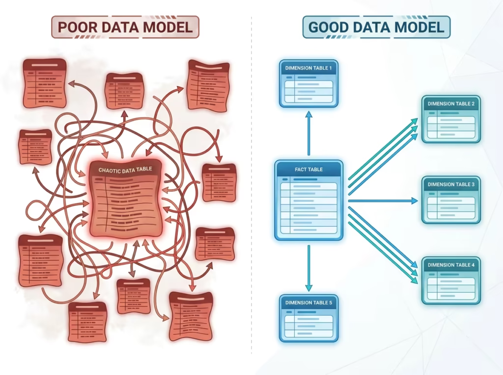
Loading one giant flat table. The most common beginner mistake is importing a single wide table containing everything facts and all descriptive attributes flattened together. This works for tiny datasets but performs poorly, wastes memory, and makes many calculations difficult or impossible. Split it into facts and dimensions.
Skipping the Date table. Relying on the auto date hierarchy or the raw date column in the fact table causes time intelligence measures to fail or return incorrect results. Build a dedicated Date table every time.
Overusing bidirectional filtering. Enabling bidirectional filtering on relationships “just in case” creates ambiguous filter paths and unpredictable results. Keep relationships single-direction unless there is a clear reason not to.
Relating tables on text columns. Building relationships on name columns or long text keys is slower and more error-prone than using clean integer keys. It also breaks when the text is not perfectly consistent across tables.
Creating unnecessary snowflake chains. Normalizing dimensions into multiple chained tables, out of habit from relational database design, adds complexity and slows Power BI without meaningful benefit in most reporting scenarios.
Leaving every column visible. A model where all key columns and technical columns are visible produces a cluttered field list that confuses report builders and invites mistakes. Hide what users do not need.
Modeling before cleaning. Attempting to build relationships on unclean, inconsistently typed data leads to failed or incorrect relationships. Clean and type the data in Power Query first, then model.
Conclusion
Data modeling is the skill that quietly determines whether a Power BI solution succeeds or struggles. A clean star schema — with a central fact table, well-structured dimension tables, single-direction relationships, integer keys, and a dedicated Date table — makes everything downstream easier. DAX measures become simpler to write. Reports load faster. New requirements are straightforward to accommodate. The whole solution becomes more reliable and far less prone to the silent errors that undermine trust in business reporting.
The hospital medical equipment example shows that these same principles scale to genuinely complex operational scenarios. The complexity is handled not by cramming everything together, but by cleanly separating the measurable events into fact tables and the descriptive context into dimension tables, then connecting them with a well-structured schema.
Start by auditing your most recent model against the star schema ideal. Is there a clear central fact table? Are dimensions connecting directly to it? Is there a dedicated Date table? Are relationships single-direction and built on integer keys? The gaps you find are your roadmap to faster, more reliable reports.
FAQ SECTION
A data model in Power BI is the collection of tables, the relationships connecting them, and the calculations built on top of them. It structures data so it can be analyzed accurately and efficiently. A well-built model determines the accuracy, speed, and maintainability of every report built on it.
A fact table stores the measurable, quantitative events of a business the values you count, sum, and average. Each row represents a single transaction or event, such as a sale or a maintenance activity. Fact tables contain numeric measures and keys that link to dimension tables, and they are usually the largest tables in a model.
A dimension table stores descriptive context the who, what, where, and when that gives meaning to facts. Each row represents a unique entity, such as a product, customer, date, or employee. Dimension tables are typically smaller than fact tables and provide the attributes used to filter and group data in reports.
A star schema is a data model structure where a single central fact table connects directly to multiple surrounding dimension tables, forming a star shape. It is the recommended structure for Power BI because it produces simple relationships, straightforward DAX measures, and fast performance. Microsoft explicitly recommends the star schema for most Power BI models.
A snowflake schema is a variation of the star schema where dimension tables are broken into further related tables, creating additional branching layers. It reduces data redundancy but adds complexity and can slow performance in Power BI. For most business reporting, a star schema is preferred over a snowflake schema.
Data modeling is important because it directly determines report accuracy, performance, and maintainability. A correct model ensures filters flow properly and calculations are accurate, delivers fast report performance, and makes the solution easy to extend. Most DAX difficulties beginners face are actually caused by an underlying data model problem.
There is no fixed number of relationships a Power BI model should have; it should have exactly the relationships needed to connect each dimension table to the fact table, typically one relationship per dimension. In a star schema, this means one one-to-many relationship from each dimension to the central fact table. The goal is a clean, unambiguous set of relationships, not a specific count.
4 thoughts on “Power BI Data Modeling Explained: Build Better and Faster Reports”