
A dashboard is the moment business intelligence becomes visible. Every connected data source, every cleaned table, every DAX measure you have written exists to arrive at this point a single screen where a decision-maker can see exactly what is happening in the business and act on it.
Yet most first attempts at a Power BI dashboard fail to deliver that clarity. They end up either too sparse to be useful or so crowded with visuals that nobody can find the number that actually matters. The difference between a dashboard people open every morning and one they ignore after the first week comes down to a small number of decisions made before you ever open Power BI Desktop.
This guide walks through every stage of that process planning, KPI selection, data preparation, the build itself, design principles, and the mistakes that quietly undermine otherwise solid dashboards. It includes a complete sales dashboard build from start to finish, along with real operational examples from sales, operations, and healthcare environments.
This article builds on concepts covered in What Is Power BI, Power BI vs Exce, and Beginner’s Guide to DAX in Power B]. If you have not yet built your first measures, the DAX guide is worth reviewing first.
What Is a Power BI Dashboard?
A Power BI dashboard is a single page that displays a curated set of visuals pinned from one or more underlying reports designed to give an at-a-glance view of the most important metrics in a business area. Dashboards live in the Power BI Service and are built for monitoring, not deep exploration.
A dashboard answers the question “how are we doing right now?” in the time it takes to glance at a screen. It is not the place for detailed analysis that role belongs to the underlying reports a dashboard is built from.
Dashboards in Power BI are tile-based. Each tile is pinned from a visual in a report, a Q&A query, or in some cases an external source such as an Excel range or a streaming dataset. Clicking a tile takes the user into the full underlying report for deeper investigation.
Dashboard vs Report: What’s the Difference?
This distinction trips up nearly every Power BI beginner, and getting it right shapes how you plan your entire build.
A report is a multi-page, fully interactive Power BI file built in Power BI Desktop. Reports contain detailed visuals, slicers, filters, and drill-down capability. Users can click, filter, and explore the underlying data freely within a report.
A dashboard is a single-page summary view built in the Power BI Service from tiles pinned out of one or more reports. Dashboards have limited interactivity — typically just clicking through to the source report and cannot be filtered with slicers in the way reports can.
| Feature | Report | Dashboard |
|---|---|---|
| Pages | Multiple | Single page only |
| Built in | Power BI Desktop | Power BI Service |
| Interactivity | Full — slicers, filters, drill-down | Limited — click-through to report |
| Data sources | One dataset per report | Can combine tiles from multiple reports/datasets |
| Purpose | Detailed exploration and analysis | At-a-glance monitoring |
| Mobile optimisation | Requires separate mobile layout | Naturally tile-based, mobile-friendly |
| Real-time data | Supported via DirectQuery/streaming | Supported via streaming tiles |
| Typical audience | Analysts, power users | Executives, managers, frontline staff |
In practice, most Power BI implementations build a detailed report first, then pin the most critical visuals from that report into a dashboard for executive and frontline consumption. The report does the analytical work; the dashboard delivers the headline.
Why Dashboards Matter in Business Intelligence
The business value of a dashboard is not the visuals themselves it is the speed and consistency of decision-making they enable.
Without a dashboard, a manager asking, “are we on track this month?” typically waits for an analyst to pull data, build a summary, and circulate it a cycle that can take hours or days and is often already outdated by the time it lands. A properly built dashboard answers that question in seconds, with data that refreshes automatically and is identical for every person viewing it.
This consistency matters more than it first appears. When five people each maintain their own version of “the numbers” in separate spreadsheets, disagreements about whose figure is correct consume meeting time that should be spent on decisions. A single, governed dashboard removes that friction entirely.
Planning Your Dashboard Before Building
The most common reason dashboards fail is that the build begins before the planning does. Before opening Power BI Desktop, answer four questions clearly.
Who is this dashboard for? A dashboard built for a CEO needs different content, density, and detail than one built for a warehouse supervisor. Identify the primary audience before designing anything.
What decision does this dashboard support? Every dashboard should exist to support a specific recurring decision or monitoring need — not simply to “show the data.” If you cannot name the decision, the dashboard does not yet have a clear purpose.
How often will it be checked? A dashboard checked hourly by an operations team needs different refresh logic and visual design than one reviewed once a month by a finance committee.
What does success look like? Define what “good” and “bad” look like for each metric before building. A revenue figure with no target or benchmark next to it forces every viewer to mentally calculate whether the number is good news or bad news.
Choosing the Right KPIs
A dashboard with twenty KPIs communicates nothing. A dashboard with four to six well-chosen KPIs communicates clearly. Choosing the right metrics is a discipline, not a data exercise.
Effective KPIs share three characteristics:
- They are actionable. If a number moves and nobody changes their behaviors as a result, it does not belong on a primary dashboard.
- They are owned. Every KPI should have a clear owner someone whose responsibility it is to respond when that number moves in the wrong direction.
- They have context. A raw number without a target, a trend, or a comparison period tells the viewer almost nothing on its own.
A useful filter when selecting KPIs: ask “if this number changed significantly tomorrow, would anyone do anything differently?” If the honest answer is no, the metric belongs in a detailed report, not the dashboard.
Preparing Your Data
A dashboard is only as reliable as the data model behind it. Before building any visuals, the following preparation steps reduce rework significantly.
Set appropriate refresh schedules. Decide how frequently the underlying dataset needs to refresh based on how the dashboard will be used, then configure scheduled refresh in the Power BI Service accordingly.
Connect to clean, validated data sources. Resolve duplicate records, inconsistent naming, and missing values in Power Query before modelling begins.
Build a proper star schema. Separate fact tables (transactions, events) from dimension tables (dates, products, regions, departments). This structure is what makes DAX measures fast and reliable.
Create a dedicated Date table. As covered in our DAX guide, time intelligence measures depend entirely on a correctly configured Date table.
Write your core measures before building visuals. Define your KPI measures in the data model first. Building visuals against well-named, tested measures is far more efficient than building visuals first and patching calculations in afterward.
Step-by-Step: Building Your First Power BI Dashboard
The following walkthrough builds a complete sales performance dashboard from start to finish, using the planning principles already covered.
Step 1: Define the Dashboard Brief
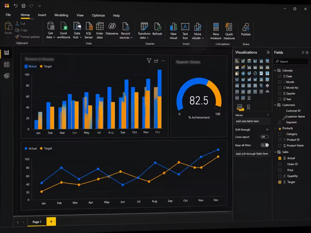
For this example, the brief is: a sales director needs a daily view of revenue performance, regional breakdown, and progress against monthly target, primarily viewed on a tablet each morning.
Step 2: Build the Underlying Report in Power BI Desktop
Connect to the sales data source and build the data model — a Sales fact table linked to Date, Product, and Region dimension tables. Write the core measures:
Total Revenue = SUMX(Sales, Sales[Quantity] * Sales[UnitPrice])
MTD Revenue = TOTALMTD([Total Revenue], 'Date'[Date])
Monthly Target = 500000
Target Achievement % = DIVIDE([MTD Revenue], [Monthly Target], 0)
Revenue PY = CALCULATE([Total Revenue], SAMEPERIODLASTYEAR('Date'[Date]))
YoY Growth % = DIVIDE([Total Revenue] - [Revenue PY], [Revenue PY], 0)
Step 3: Build the Core Visuals in the Report
- A KPI card showing MTD Revenue against Monthly Target
- A line chart showing daily revenue trend across the current month
- A map or bar chart showing revenue by region
- A table showing top ten products by revenue
- A gauge visual showing Target Achievement %
Step 4: Apply Filters and Test Interactivity
Add a date slicer and a region slicer to the report page. Click through each one to confirm that every visual responds correctly and that DAX measures recalculate as expected.
Step 5: Publish to the Power BI Service
Publish the report from Power BI Desktop to a workspace in the Power BI Service. Confirm the dataset refresh schedule is configured correctly.
Step 6: Create the Dashboard
In the Power BI Service, open the published report and pin the five core visuals to a new dashboard. Arrange the tiles so the most important figure — Target Achievement % — sits in the top-left position, where attention naturally lands first.
Step 7: Configure Mobile Layout
Switch to the mobile layout editor within the dashboard settings and confirm that tiles stack in a sensible order for phone and tablet viewing, since this dashboard’s primary use case is tablet-based.
Step 8: Share and Set Permissions
Share the dashboard with the sales director and relevant team members through a workspace App, applying row-level security if regional managers should see only their own territory’s data.
This sequence — brief, model, report, test, publish, pin, mobile check, share — applies to virtually any dashboard build, regardless of industry or complexity.
Selecting the Right Visuals
Choosing the correct visual type for each metric is as important as the underlying data quality. The wrong visual can make accurate data look misleading.
| Data Type / Question | Recommended Visual |
|---|---|
| A single key number against a target | Card or KPI visual |
| Trend over time | Line chart |
| Comparison across categories | Bar or column chart |
| Part-to-whole composition | Stacked bar chart (avoid pie charts for more than 4–5 categories) |
| Geographic distribution | Map or filled map |
| Progress toward a goal | Gauge visual |
| Detailed row-level data | Table or matrix |
| Correlation between two variables | Scatter chart |
| Multi-dimensional ranking | Matrix with conditional formatting |
| Process duration or scheduling | Gantt chart (custom visual) |
A common beginner error is defaulting to pie charts for everything. Pie charts work well for two to four categories and become difficult to read accurately beyond that. Bar charts almost always communicate category comparisons more clearly.
Dashboard Design Best Practices
Strong dashboard design follows established usability principles, not aesthetic preference alone.

Follow the Z-pattern or F-pattern of visual attention. Eyes typically scan a screen from top-left, across, and down. Place your single most important metric in the top-left tile.
Limit each dashboard to one screen, no scrolling. If a dashboard requires scrolling to see all tiles, it has too much content. Split it into a dashboard plus a linked detailed report instead.
Use consistent colour coding throughout. If green means “on target” on one visual, it should mean the same thing on every visual across the entire dashboard. Inconsistent colour logic is one of the fastest ways to undermine trust in a dashboard.
Group related metrics visually. Tiles covering the same business area should sit near each other, with clear visual separation from unrelated metric groups.
Apply white space deliberately. A dashboard with every pixel filled is harder to read than one with breathing room around each tile. Resist the urge to fill empty space with another visual.
Use titles that state the insight, not just the metric. “Revenue Trending 8% Above Target” communicates more immediately than a generic title like “Revenue.”
Test with the actual end user before finalising. A dashboard that makes sense to the analyst who built it does not automatically make sense to the operations manager who will use it daily. A short usability check with the real audience catches confusion early.
Mobile Friendly Dashboard Design
A meaningful share of dashboard views in modern organizations happen on phones and tablets during a commute, on a factory floor, or between meetings. Power BI’s mobile layout editor allows a dedicated mobile arrangement separate from the desktop dashboard layout, and using it properly makes a measurable difference to adoption.

Design for vertical scrolling, not horizontal. Mobile dashboards should stack tiles in a single vertical column in priority order, since mobile screens are taller than they are wide.
Prioritise the single most critical metric at the very top. On a small screen, only the first one or two tiles are seen without scrolling. The most important KPI must be the first thing visible.
Simplify visuals for small screens. A detailed matrix with fifteen columns is unreadable on a phone. Use the mobile layout editor to swap detailed visuals for simplified cards or short bar charts.
Test on an actual device before rollout. Power BI Mobile renders differently across screen sizes. Reviewing the dashboard on a real phone, not just the desktop preview, catches layout problems that are otherwise easy to miss.
Real-World Dashboard Examples Across Industries
The principles above apply consistently, but the specific KPIs and visual choices shift meaningfully by industry. The following three scenarios illustrate how the same dashboard-building discipline produces very different outputs depending on the business context.
Sales Reporting Dashboard
A sales dashboard typically centres on revenue against target, pipeline conversion rate, average deal size, and territory performance. The build covered in the step-by-step section above is a direct example of this category — designed for daily monitoring by sales leadership with a strong emphasis on trend and target achievement.
Operations Reporting Dashboard
An operations dashboard shifts focus toward throughput, efficiency, and exception monitoring. Typical KPIs include units produced per shift, on-time delivery rate, defect or error rate, and resource utilisation. Operations dashboards are often viewed more frequently than sales dashboards sometimes hourly which makes refresh frequency and visual simplicity especially important. A cluttered operations dashboard slows down the floor-level decisions it exists to support.
Healthcare Analytics Dashboard
Healthcare dashboards carry additional governance and accuracy requirements given the operational and clinical stakes involved. Common categories include patient flow (admissions, discharges, bed occupancy), appointment and waiting time tracking, staff utilisation, and equipment performance. Row-level security is particularly important in this context, since different departments and roles typically require access to different subsets of data under strict governance policies.
The next section examines one specific, high-value healthcare analytics use case in detail.
Medical Equipment Performance Dashboard Example
Healthcare organisations manage large inventories of clinical and diagnostic equipment imaging machines, infusion pumps, ventilators, monitoring devices where unplanned downtime carries both operational and patient safety consequences. A well-built Power BI dashboard for medical equipment performance gives biomedical engineering and facilities teams the visibility needed to manage that risk proactively rather than reactively.

Equipment Uptime
Uptime percentage is the foundational KPI for this dashboard category. It is calculated as the proportion of scheduled operational time during which a piece of equipment was available and functioning.
Equipment Uptime % =
DIVIDE(
    [Total Available Hours] - [Total Downtime Hours],
    [Total Available Hours],
    0
)
A dashboard tile showing this measure broken down by equipment category — imaging, monitoring, life support — immediately highlights which categories are underperforming against the organisation’s uptime targets, which in regulated healthcare environments are often contractually or compliance-defined.
Maintenance Compliance
Maintenance compliance tracks the percentage of scheduled preventive maintenance tasks completed within their required time window. This metric is frequently tied to regulatory and accreditation requirements, making it a high-visibility figure for compliance and biomedical engineering leadership.
Maintenance Compliance Rate =
DIVIDE(
    [Maintenance Tasks Completed On Time],
    [Total Scheduled Maintenance Tasks],
    0
)
A matrix visual breaking this down by department and equipment type allows facilities managers to identify exactly where maintenance schedules are slipping before it becomes an audit finding.
Downtime Tracking
Downtime tracking goes beyond the uptime percentage to show the underlying causes and duration of equipment unavailability. A well-designed downtime section typically includes:
- Total downtime hours by equipment category
- Mean Time To Repair (MTTR), calculated as average repair duration per incident
- Downtime root cause breakdown (mechanical failure, software fault, awaiting parts, scheduled maintenance)
- A trend line showing whether downtime incidents are increasing or decreasing month over month
Mean Time To Repair =
DIVIDE([Total Repair Duration Hours], [Total Repair Incidents], 0)
This level of detail allows biomedical engineering teams to distinguish between equipment that fails occasionally but is repaired quickly, and equipment with infrequent but prolonged failures — two very different operational risks that a single uptime percentage would otherwise mask.
Preventive Maintenance KPIs
Preventive maintenance metrics shift the dashboard’s focus from reactive repair to proactive risk reduction. Key measures in this category include:
- Preventive Maintenance Schedule Adherence — the percentage of preventive tasks completed before their due date, rather than merely completed eventually
- Mean Time Between Failures (MTBF) — average operational time between equipment breakdowns, an indicator of underlying equipment reliability
- Overdue Maintenance Count — a real-time count of equipment currently past its scheduled maintenance window, ideally surfaced as an alert tile rather than buried in a table
MTBF = DIVIDE([Total Operational Hours], [Total Failure Count], 0)A well-built medical equipment dashboard places the Overdue Maintenance Count tile prominently, since this is the figure most directly tied to immediate compliance and safety risk — consistent with the earlier principle that the most actionable metric belongs in the most visible position.
This category of dashboard demonstrates clearly why generic dashboard advice is insufficient in regulated, operationally complex environments. The KPI selection, governance requirements, and visual prioritisation all differ meaningfully from a standard commercial reporting context, and building them correctly requires genuine domain understanding alongside Power BI technical skill.
Common Dashboard Mistakes
Building the dashboard before defining its purpose. Without a clear answer to “what decision does this support,” dashboards drift into displaying whatever data happens to be available rather than what actually matters.
Including too many KPIs. A dashboard attempting to serve every possible stakeholder ends up serving none of them well. Build focused dashboards for specific audiences rather than one dashboard trying to do everything.
Inconsistent colour logic. Using red and green inconsistently across different tiles erodes trust faster than almost any other design flaw.
Ignoring mobile users. A dashboard that looks polished on a wide desktop monitor but is unusable on a phone fails a meaningful portion of its actual audience.
Skipping the underlying data model quality. No amount of visual polish compensates for an unreliable or poorly structured data model. Dashboard problems are very often data model problems in disguise.
No defined refresh schedule communicated to users. If users do not know whether they are looking at real-time data or last week’s snapshot, they lose confidence in the numbers regardless of accuracy.
Designing for the builder instead of the audience. The person building the dashboard is rarely its primary user. Skipping usability testing with the actual intended audience is a consistently underestimated mistake.
Power BI Dashboard Performance Tips
A slow-loading dashboard undermines adoption just as quickly as a poorly designed one. The following practices keep dashboards responsive as data volumes grow.
- Reduce the number of visuals per page. Each visual generates its own query; fewer, well-chosen visuals load faster than many small ones.
- Use Import mode over DirectQuery where real-time data is not strictly required. Import mode generally delivers significantly faster performance for typical reporting scenarios.
- Avoid excessive calculated columns. As covered in our DAX guide, calculated columns increase model size and memory usage. Favour measures wherever possible.
- Limit the use of high-cardinality fields in visuals. Fields with very large numbers of unique values, such as raw transaction IDs, slow down visual rendering when used directly in charts.
- Apply aggregations for large fact tables. For very large datasets, building pre-aggregated summary tables alongside detailed fact tables improves report responsiveness significantly.
- Review the Performance Analyzer regularly. Power BI Desktop’s built-in Performance Analyzer tool identifies exactly which visuals and queries are slowing down a report, allowing targeted optimisation rather than guesswork.
Conclusion
Building a Power BI dashboard that people actually use every day is less about technical complexity and more about disciplined decision-making before the build begins. Define the audience, define the decision the dashboard supports, choose a small number of genuinely actionable KPIs, and build the underlying data model properly before touching a single visual.
The sales dashboard walkthrough in this guide demonstrates the full sequence in a straightforward commercial context. The medical equipment example shows how the same discipline extends into a regulated, operationally complex environment where the right KPIs and governance choices carry real consequences.
Whether you are building your first sales dashboard or a compliance-critical healthcare analytics tool, the underlying principles remain the same: plan first, model carefully, design for the audience, and test before you roll out.
Continue the Zytriona Power BI series: [What Is Power BI?] — [Power BI vs Excel] — [Beginner’s Guide to DAX] — Dashboard Best Practices — [Power Automate for Reporting] — [Power BI for Healthcare Analytics].
FAQ SECTION
A Power BI dashboard is used to give an at-a-glance view of the most important business metrics on a single screen. It supports fast, daily monitoring and decision-making, pulling together key visuals pinned from one or more underlying reports.
A report is a multi-page, fully interactive file built in Power BI Desktop with slicers and drill-down capability. A dashboard is a single-page summary built in the Power BI Service from tiles pinned out of one or more reports, designed for quick monitoring rather than detailed exploration.
Most effective Power BI dashboards display between four and six key KPIs. Including too many metrics dilutes attention and makes it harder for viewers to identify what genuinely requires action, reducing the overall effectiveness of the dashboard.
Yes. Power BI dashboards are tile-based by design, which makes them naturally suited to mobile viewing. Power BI’s mobile layout editor allows a dedicated mobile arrangement separate from the desktop layout, ensuring tiles display correctly on phones and tablets.
Common KPIs for medical equipment dashboards include equipment uptime percentage, maintenance compliance rate, Mean Time To Repair (MTTR), Mean Time Between Failures (MTBF), and overdue preventive maintenance count. These metrics together give biomedical engineering and facilities teams visibility into both equipment reliability and compliance status.
Common causes of slow Power BI dashboards include too many visuals on a single page, excessive use of DirectQuery instead of Import mode, high-cardinality fields used directly in visuals, and an unoptimised data model with too many calculated columns. Power BI’s Performance Analyzer tool helps identify the specific cause.
Basic dashboards can be built using simple aggregations without writing DAX. However, dashboards that include targets, percentage achievement, year-over-year comparisons, or any custom calculation typically require DAX measures, making a working knowledge of DAX valuable for building genuinely useful dashboards.