
Building a Power BI dashboard and building a good Power BI dashboard are two different skills. The technical steps connecting data, writing measures, pinning visuals can be learned in a few weeks. The design and communication skills that determine whether a dashboard actually gets used, trusted, and acted upon take longer to develop, and they are rarely taught in standard Power BI tutorials.
This guide covers ten Power BI dashboard best practices drawn from real operational reporting environments sales, operations, executive reporting, and healthcare analytics. Each practice addresses a specific failure pattern that appears repeatedly in dashboards that look complete but underperform in daily use.
If you have already built your first dashboard and want to raise the quality of your output to a professional standard, these principles give you a clear improvement path.
This article builds on What Is Power BI, Power BI vs Excel, Beginner’s Guide to DAX in Power BI and How to Build Your First Power BI Dashboard. If you have not yet built a working dashboard, the step-by-step guide covers the foundations before this article’s principles become fully applicable.
What Makes a Great Dashboard?
A great Power BI dashboard does one thing consistently: it helps a specific person make a specific decision faster and more confidently than they could without it. That definition is deceptively simple, and most dashboard problems trace back to losing sight of it.
The technical quality of a dashboard, how cleanly the data model is built, how efficiently the DAX measures run, how carefully the visuals render matters enormously to the people who build it. But the audience for most dashboards does not evaluate technical quality. They evaluate whether the dashboard tells them what they need to know quickly and whether they can trust the numbers they see.
Professional dashboard design bridges the gap between technical correctness and operational usefulness. The ten practices below address both.
Why Dashboard Design Matters
Dashboard design is not an aesthetic exercise. It is a communication discipline. How a dashboard is designed determines whether the right people read the right information at the right time or whether they skip past it, misinterpret it, or stop opening it after the first week.
Research in data visualization consistently shows that poorly designed visual displays cause viewers to draw incorrect conclusions even when the underlying data is accurate. A bar chart with a truncated axis, a pie chart with eight segments, or a screen so dense with information that nothing stands out each of these imposes cognitive load that degrades decision quality.
In a commercial environment, this matters because the purpose of business intelligence is to improve decisions. A dashboard that creates confusion rather than clarity is not just unhelpful it actively undermines the value of the underlying data infrastructure.
Start With Business Questions, Not Data
The most professional Power BI dashboards are built backward from a question, not forward from available data. Before selecting a single visual or writing a single measure, identify the specific question the dashboard must answer.

This sounds obvious. In practice, most dashboards are built by analysts who open their available datasets and ask “what can I show?” rather than asking “what decision does this need to support?” The difference in output quality is significant.
A useful starting point is a structured stakeholder conversation with three questions:
- What decision are you making on a regular basis that this dashboard should inform?
- What would you do differently if this metric changed by twenty percent?
- What do you currently know too late, and what would you change if you knew it sooner?
A metric that cannot be linked to a clear answer to these questions does not belong on a primary dashboard. It belongs in an underlying report available through a click-through.
Choose the Right KPIs
Effective KPI selection for a Power BI dashboard follows a discipline separate from data availability. The most important metrics are not necessarily the easiest ones to calculate and the most requested metrics are not necessarily the most actionable.
Every KPI on a professional dashboard should satisfy four criteria:
- Actionable: A movement in this number prompts a specific response from someone in the organisation.
- Owned: One person or team is clearly accountable for this metric.
- Contextualized: The number is shown alongside a target, a trend, or a comparison period never as a raw figure with no reference point.
- Current: The KPI reflects data recent enough to support the decision it informs.
A useful distinction when selecting KPIs is the difference between lagging and leading indicators. Lagging indicators total revenue last month, customer complaints last quarter measure what has already happened. Leading indicators pipeline value, maintenance tasks overdue, response times this week predict what is about to happen. Professional dashboards balance both, because lagging indicators confirm what occurred while leading indicators create the opportunity to intervene before results solidify.
The practical rule for primary dashboards: four to six KPIs maximum. Every additional metric beyond that threshold competes for attention with every other metric and reduces the likelihood that any single number receives the focus it needs.
Keep Layout Simple
Dashboard layout follows established principles of visual attention that work whether the viewer is a CFO reviewing quarterly performance or a floor supervisor checking production output before a shift briefing.
Eye-tracking research shows that most people scan a screen in a Z-pattern top left to top-right, then diagonally down to bottom-left, then across to bottom-right. Place your single most critical KPI in the top-left tile, where attention lands first. Place supporting context trend charts, breakdowns, secondary metrics in the positions that follow in the natural scanning path.
The non-negotiable rule for professional dashboard design is the one-screen constraint. A dashboard that requires scrolling has too much content. If the information does not fit on a single screen without scrolling, split it into a focused dashboard for the primary audience and a more detailed underlying report for users who need depth.
A practical starting layout for most business dashboards:
- Top row: Three to four KPI cards the headline numbers the dashboard exists to answer
- Middle row: One or two charts providing trend and context (a line chart for time trend, a bar chart for category comparison)
- Bottom row: A breakdown table or matrix for users who want to understand the composition of the headline numbers
This structure is not rigid content requirements vary. But beginning with this framework and removing elements that do not earn their space produces stronger results than beginning with a blank canvas and filling it.
Use Consistent Colour Coding
Colour in a Power BI dashboard is a communication tool, not a decoration decision. Every colour choice should carry consistent meaning across the entire dashboard if green means “on target” in one visual, it must mean “on target” in every visual on every page.

A professional colour framework for business dashboards:
- Green: On target, performing above benchmark, no action required
- Amber / Orange: Approaching threshold, monitoring required, attention advised
- Red: Below target, action required, exception condition
- Blue or grey (primary brand colour): Neutral data display the default for non-conditional visuals
Power BI’s conditional formatting allows tile backgrounds, font colours, and data bar colours to change dynamically based on KPI thresholds. Applying this to KPI cards a green card when performance is above target, amber when within ten percent, red when below gives viewers an instant status signal without reading a single number.
Limit the total colour palette to two or three primary brand colours plus the traffic-light trio above. Dashboards using six or more distinct colours force viewers to build a mental legend for each, which is cognitive work that delays the insight.
Accessibility matters here too. Approximately eight percent of men have some form of colour blindness, most commonly red-green. Using colour alongside a secondary signal an icon, a text label, or a pattern fill ensures the dashboard is readable for colour-blind users without sacrificing the visual impact for those who see full colour.
Select the Right Visual for Each Metric
Visual type selection is one of the most consequential design decisions in a Power BI dashboard, and it is one of the areas where beginners most frequently make preventable errors.
| Data Question | Right Visual | Wrong Visual |
|---|---|---|
| How are we tracking against a target? | KPI card or gauge | Table |
| How does performance trend over time? | Line chart | Bar chart |
| How do categories compare? | Bar or column chart | Pie chart (>4 categories) |
| What share does each part represent? | Stacked bar or treemap | Pie chart (>5 segments) |
| Where is performance distributed geographically? | Map or filled map | Table with region column |
| What does this number mean in detail? | Matrix with conditional formatting | Multiple individual visuals |
| How correlated are two metrics? | Scatter chart | Two separate line charts |
| What is the current status of a single KPI? | Card visual | Chart with one bar |
The single most misused visual in business dashboards is the pie chart. Pie charts are readable with three or four segments. Beyond that, viewers cannot accurately judge the relative size of segments without data labels at which point a bar chart displays the same information more accurately and more quickly. As a general practice: if a pie chart has more than four segments, replace it with a bar chart.
Avoid three-dimensional chart effects entirely. 3D bars and 3D pie charts distort the visual representation of values, making accurate comparison impossible. They are a legacy feature of spreadsheet charting that professional dashboard design has moved past.
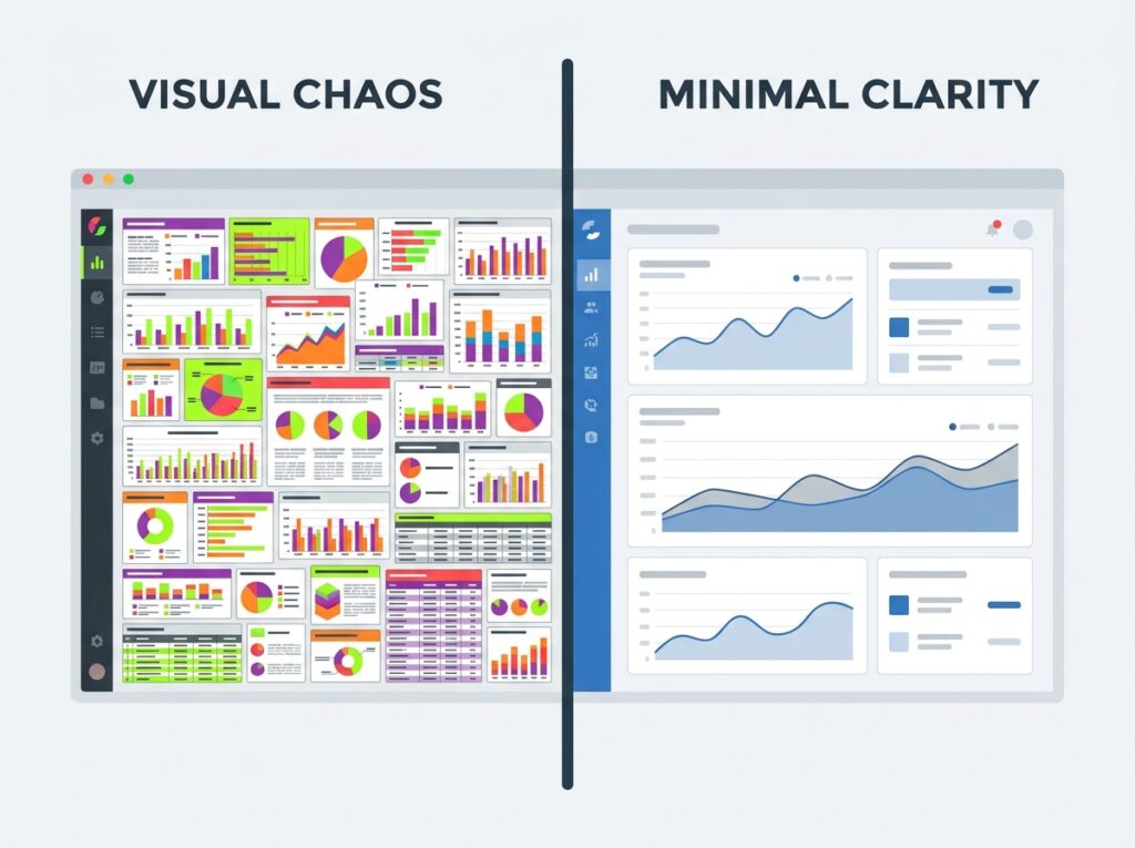
Reduce Visual Clutter
Visual clutter is the accumulation of elements on a dashboard that consume attention without delivering information. Edward Tufte’s concept of the data-ink ratio is useful here: every mark on a dashboard should either carry information or actively support the communication of information. Everything else is clutter, and clutter degrades the speed and accuracy with which viewers extract insight.
The most common sources of clutter in Power BI dashboards:
- Chart borders: Remove all visual borders unless they are necessary for logical grouping.
- Gridlines: Reduce gridline opacity to the minimum required for readability, or remove them entirely for simple bar charts.
- Drop shadows and glow effects: These are decorative, not informational. Remove them.
- 3D effects: As noted above — always remove.
- Background images: Dashboard backgrounds should be flat and neutral unless a background image carries specific meaning. Texture and gradient backgrounds compete with data for visual attention.
- Excessive data labels: Label what needs to be read precisely. Leave trend context to the chart shape.
- Too many slicers: Each slicer added to a dashboard page reduces the space available for actual metrics and increases the time users spend configuring their view rather than reading it.
White space empty space between and around visual elements is an active design tool, not wasted screen area. Adequate white space between tiles reduces the cognitive load of parsing a dense screen and directs attention toward the content that matters.
Design for Mobile Users
A significant share of executive and frontline dashboard views happen on phones and tablets, outside the desktop browser environment. Building a Power BI dashboard without testing and configuring the mobile experience means a meaningful portion of the audience is receiving a degraded version of the work.

Power BI’s mobile layout editor allows a completely separate tile arrangement for mobile viewing, independent of the desktop layout. Steps for configuring a professional mobile layout:
- Open the dashboard in the Power BI Service and select the mobile layout view.
- Drag tiles into a single vertical column, ordered by priority — the most critical KPI at the top.
- Resize each tile to fill the column width, eliminating narrow tiles that are difficult to tap on small screens.
- Remove any tiles that are unreadable at phone screen dimensions — detailed matrices, small text tables — and rely on the click-through to the underlying report for that detail.
- Test on a physical device, not just the desktop preview tool. Rendering differs between preview and actual mobile hardware.
The mobile layout design principle is the same as the general layout principle, with higher intensity: one primary KPI visible above the fold, secondary context available by scrolling, detail available through a tap to the report.
Optimize Dashboard Performance
A technically accurate dashboard that loads slowly loses its audience. Response time is a usability factor, and dashboards that take more than a few seconds to load create doubt about whether the data has refreshed undermining trust in the output.

The fastest route to diagnosing a slow Power BI dashboard is the Performance Analyzer, available in Power BI Desktop’s View ribbon. It records exactly how long each visual takes to render and whether the delay is in the DAX query, the data rendering, or other elements. This removes guesswork from performance optimization and points directly to the highest-impact fix.
The most effective performance improvements for most Power BI dashboards:
Use Import mode over Direct Query where possible. Direct Query queries the source database on demand, which can be slow for complex datasets. Import mode loads the data into Power BI’s in-memory engine, delivering significantly faster visual rendering.
Reduce the number of visuals per dashboard page. Every visual generates a separate query. A dashboard with fifteen visuals generates fifteen queries on load. Reducing to six to eight core visuals reduces load time proportionally.
Replace calculated columns with measures. As detailed in our [Beginner’s Guide to DAX in Power BI], calculated columns increase the in-memory size of the dataset and slow refresh times. Measures are computed on demand and are far more efficient for aggregation logic.
Avoid high-cardinality fields in visual axes. Fields with very large numbers of unique values raw transaction IDs, timestamp fields with second-level precision — slow down visual rendering when placed directly on chart axes. Aggregate to the appropriate level before visualizing.
Apply aggregation tables for very large datasets. For datasets with hundreds of millions of rows, building pre-aggregated summary tables alongside the detailed fact table allows dashboard visuals to query the summary layer rather than the full dataset.
Test With Real End Users
The analyst who builds a dashboard is almost never its primary user. This creates a systematic blind spot: what makes sense to the builder does not automatically make sense to the person who will use the dashboard every day.

Jakob Nielsen’s foundational usability research established that five test users identify approximately eighty-five percent of the usability problems in any interface. Applied to Power BI dashboards, a twenty-minute session with five real users watching them find specific metrics and complete specific tasks on the dashboard without guidance reveals almost every significant design problem before rollout.
During a dashboard usability test, observe and record:
- How long it takes the user to identify the primary KPI without being directed to it
- Whether they attempt to interact with a visual in a way that is not supported (e.g., clicking a tile expecting a filter rather than a drill-through)
- Where their attention goes first does it align with where the most important information is placed?
- What questions they ask while viewing the dashboard unanswered questions indicate missing context
- Whether they express confusion about any visual, label, or layout element
The most common usability problems found through this process are: metric titles that make sense to the builder but not the viewer; missing units or currency labels; colour choices that carry ambiguous meaning; and tile sizes that do not reflect the relative importance of the information they display.
Testing is not optional for professional dashboard delivery. It is the step that distinguishes a dashboard built to a specification from one confirmed to actually work.
Review and Improve Regularly
A dashboard is not a finished product on its launch day. Business priorities shift, data sources evolve, and the audience’s needs change as their familiarity with the tool grows. Professional dashboard management includes a structured review cadence.
Power BI provides built-in usage metrics for dashboards and reports in the Service. The Usage Metrics report shows view count per day, unique viewers, viewing device breakdown, and which pages or tiles receive the most interaction. This data reveals whether a dashboard is being used as intended and identifies dashboards that have low or declining usage, which is an early signal that the content is no longer meeting the audience’s needs.
A practical quarterly dashboard review covers:
- Are the KPIs still the right ones? Have business priorities shifted since this dashboard was built?
- Is the data still refreshing correctly? Are there any failed refresh notifications that have not been addressed?
- Are there visuals that users consistently ignore? If so, they should be removed or moved to the underlying report.
- Has the target audience changed? A dashboard built for a team of five may need rethinking if the audience has grown to fifty.
- Are there new Power BI features that would improve performance or usability for this specific dashboard?
Dashboards that are never reviewed tend to accumulate unused tiles, stale data connections, and KPIs that no longer reflect current priorities. Regular review keeps a dashboard valuable rather than letting it slowly become irrelevant.
Dashboard Design Lessons From Real Operational Reporting
The best practices above apply consistently. How they translate into specific design decisions varies significantly by context. The following four environments illustrate how the same principles produce different outputs when the audience and purpose change.
Executive Dashboards
Executive dashboards are the most stripped-back in any organisation. The audience is looking at a screen for ninety seconds between meetings, not sitting down for analysis. Every principle of simplicity applies at its maximum intensity: four to five KPIs only, card visuals for each, one trend chart maximum, no slicers.
The most common mistake in executive dashboards is including information that would be useful to an analyst. Executives need to know whether each key number is good, bad, or needs their attention not how to filter the underlying data.
Conditional formatting doing the visual signalling (red/amber/green backgrounds on KPI cards) is more valuable in executive dashboards than in any other context, because the colour signal communicates the status of each metric before the viewer reads the number.
Operations Dashboards
Operations dashboards serve a different purpose they are monitoring tools, often viewed continuously or on very short refresh cycles, by teams who need to identify and respond to exceptions in near real-time.
The design priority shifts from “showing the right KPIs” to “surfacing exceptions immediately.” Alert tiles, threshold indicators, and clear visual distinction between normal operation and exception conditions become the primary design work. An operations dashboard that shows fifty metrics in equal visual weight is useless for exception monitoring. One that highlights the two or three metrics currently outside their acceptable range gives the operations team exactly what they need.
Medical Equipment Performance Dashboards
As covered in our [How to Build Your First Power BI Dashboard] guide, medical equipment dashboards serve biomedical engineering and facilities management teams with a dual-purpose operational monitoring and compliance demonstration.
Design decisions in this context carry additional governance weight. The metrics must be precisely defined and consistently calculated, because they may be referenced in audits or accreditation reviews. Colour coding for compliance status (maintenance overdue, equipment below uptime threshold) must be unambiguous.
The most important tile in a medical equipment dashboard is typically the Overdue Maintenance count a live count of equipment currently past its scheduled preventive maintenance date. This tile belongs in the top-left position, the highest-visibility spot on the screen, because it is the metric most directly tied to immediate compliance and safety risk.
Maintenance KPI Dashboards
Maintenance dashboards whether in healthcare, manufacturing, or facilities management share a common structural challenge: they need to show both reactive performance (what happened when equipment failed) and proactive performance (how well maintenance is preventing failures).
The most effective layout for a maintenance KPI dashboard separates these two hemispheres visually. The left side of the screen shows reactive metrics: incident count, Mean Time To Repair, downtime hours by asset category. The right side shows preventive metrics: schedule adherence, upcoming tasks, overdue count. This separation makes it immediately obvious whether a team’s energy is being consumed by reactive response or effectively invested in prevention.
Comparing Good and Poor Dashboard Design
Understanding the principles above is reinforced by seeing the contrast between their application and their absence.
Good Dashboard vs Poor Dashboard
| Dimension | Good Dashboard | Poor Dashboard |
|---|---|---|
| KPI count | 4–6 focused metrics | 15–20 metrics on one page |
| Layout | One screen, no scrolling | Requires scrolling to see all content |
| Colour use | Consistent semantic coding | Different colours used decoratively throughout |
| Visual types | Right visual for each data type | Default charts regardless of data structure |
| White space | Clear breathing room between tiles | Every pixel filled |
| Audience fit | Designed for one specific audience | Attempts to serve every possible stakeholder |
| Data context | KPIs shown with target and trend | Raw numbers with no reference |
| Performance | Loads in under three seconds | Slow rendering; delayed data loading |
| Mobile | Optimised layout for phone/tablet | Desktop layout only |
| Maintenance | Reviewed and updated quarterly | Never reviewed after launch |
Good Practice vs Poor Practice
| Good Practice | Poor Practice |
|---|---|
| 6–8 visuals per page | 20+ visuals per page |
| Consistent brand colour palette | Rainbow colours across charts |
| KPI-focused, decision-driven content | Everything available on one screen |
| Adequate white space between tiles | Cluttered, edge-to-edge tiles |
| Conditional formatting for KPI status | Static visuals with no threshold signalling |
| Mobile layout configured separately | Desktop-only design assumed |
| Tested with real end users | Launched without usability review |
| Scheduled refresh communicated to users | Users unsure if data is current |
| Import mode for performance | DirectQuery on slow source systems |
| Quarterly review and update cadence | Never revisited after first publication |
Healthcare Dashboard Design Example
Healthcare dashboards operate under constraints that make professional design discipline not just best practice but operationally necessary. Data accuracy, role-based access, and refresh reliability carry regulatory and patient safety implications that do not exist in most commercial reporting environments.

A clinical operations dashboard for a hospital’s admissions and discharge team illustrates the specific design decisions these constraints produce.
Primary KPIs for the top row:
- Current bed occupancy percentage (with target of 85% occupancy)
- Average length of stay current month vs prior month
- Patients awaiting discharge (real-time count)
- Emergency admissions today vs seven-day average
Middle section:
- Hourly admissions and discharges trend for the current day (line chart)
- Ward-level bed status breakdown (matrix with conditional formatting green for capacity, amber for near-capacity, red for full)
Design-specific decisions for this environment:
- Row-level security applied so ward managers see only their ward’s data while hospital leadership sees the complete picture
- Refresh configured to hourly, with the last refresh timestamp prominently displayed in healthcare, users need to know precisely how current the data is
- No decorative design elements clean, white background, clinical colour scheme
- All KPIs labelled with units (hours, count, percentage) because the same dashboard is viewed by clinical staff, administrative staff, and management who each bring different default assumptions about what a number represents
This dashboard illustrates an important principle: the more high-stakes the operational context, the more conservative and precise the design must be. A healthcare dashboard is not the place for creative visual choices. Every decision should reduce ambiguity, not introduce it.
Dashboard Audit Checklist
Use this checklist before publishing any Power BI dashboard to confirm professional quality standards have been met.
Planning and content:
- Dashboard purpose and audience are defined in writing
- Every KPI is actionable and has a clear owner
- All KPIs are shown with a target, trend, or comparison period
- KPI count is six or fewer on the primary dashboard
Layout and design:
- All content visible without scrolling on the target screen size
- Most important metric is in the top-left tile
- Adequate white space between tiles
- Consistent colour coding applied throughout
- No 3D effects, drop shadows, or background images
Visuals and data:
- Each visual type is appropriate for its data question
- No pie charts with more than four segments
- Conditional formatting applied to KPI status tiles
- All visuals have descriptive, non-generic titles
Technical quality:
- Dataset refresh schedule is configured and tested
- Last refresh timestamp is visible to users
- Performance Analyzer shows all visuals loading within three seconds
- Row-level security tested for all user roles
Testing and launch:
- Dashboard tested on desktop, tablet, and phone
- Mobile layout configured in the mobile layout editor
- Usability test completed with at least two actual end users
- Sharing and permissions verified for intended audience
Common Dashboard Design Mistakes
Even experienced Power BI users make these mistakes consistently. Naming them explicitly is the fastest way to avoid them.
Building for the builder, not the audience. The person who builds a dashboard knows how it works, what the data means, and where everything is located. First-time viewers do not have that knowledge. Every design decision should be evaluated from the perspective of someone seeing this dashboard for the first time.
Using colour without consistent meaning. A dashboard where blue means “selected” in one visual and “highest value” in another creates confusion that erodes trust in the data itself.
Reporting too many metrics at equal visual weight. When everything is equally prominent, nothing is. The most important metric should be the most visually dominant element on the screen.
Launching without telling users what they are looking at. A dashboard with no documentation, no defined refresh schedule, and no clear unit labels forces users to guess and they will guess incorrectly.
Never reviewing dashboards after launch. A dashboard that was accurate and useful on its launch date may become inaccurate or irrelevant within six months if it is not reviewed. Dashboards that are not maintained lose credibility, and once users lose confidence in a dashboard they rarely return to it.
Conclusion
The difference between a Power BI dashboard that gets used every day and one that gets ignored after a week is almost never about technical complexity. It is about the design discipline applied before and during the build defining the audience, choosing the right KPIs, laying out the screen with visual hierarchy in mind, removing clutter, testing with real users, and reviewing on a regular cadence.
The ten practices in this guide give you a framework for applying that discipline consistently, regardless of whether you are building a sales performance dashboard for a commercial team or a medical equipment compliance dashboard for a healthcare facility.
Start by auditing your most recent dashboard against the checklist in this article. The gaps that show up are your improvement roadmap.
The next article in the Zytriona Power BI series covers Power Automate for business reporting including how to connect automated alerts and report distributions directly to the dashboards you have now learned to build professionally.
FAQ SECTION
Power BI dashboard best practices include starting with a clear business question, limiting KPIs to four to six per dashboard, using consistent semantic colour coding, selecting the right visual type for each data question, removing visual clutter, configuring a mobile layout, optimising data model performance, and testing with real end users before launch.
Power BI dashboard best practices include starting with a clear business question, limiting KPIs to four to six per dashboard, using consistent semantic colour coding, selecting the right visual type for each data question, removing visual clutter, configuring a mobile layout, optimising data model performance, and testing with real end users before launch.
Use a consistent semantic colour system: green for on-target or positive status, amber for approaching a threshold, and red for below target or requiring action. Limit the overall palette to two to three brand colours plus this traffic-light set. Apply conditional formatting so KPI tile colours change automatically based on performance thresholds.
To improve Power BI dashboard performance: switch from DirectQuery to Import mode where real-time data is not required, reduce the number of visuals per page, replace calculated columns with DAX measures, avoid placing high-cardinality fields directly in visual axes, and use the Performance Analyzer tool in Power BI Desktop to identify which specific visuals are causing delays.
The most common Power BI dashboard design mistake is building for the builder rather than the audience. Analysts who design dashboards typically already understand the data deeply, and they tend to include too much information and too many options. Professional dashboards are focused, minimal, and designed to be understood immediately by someone seeing them for the first time.
Use Power BI’s mobile layout editor in the Power BI Service to create a separate tile arrangement for mobile viewing. Stack tiles in a single vertical column ordered by importance, with the primary KPI at the top. Remove any visuals that are too detailed to read on a small screen, and test the final layout on a physical device rather than relying only on the desktop preview.
Power BI dashboards should be reviewed at least quarterly. A review should check whether KPIs remain relevant to current business priorities, whether data refresh is functioning correctly, whether usage metrics show sustained audience engagement, and whether any visual improvements or data model optimisations should be applied.